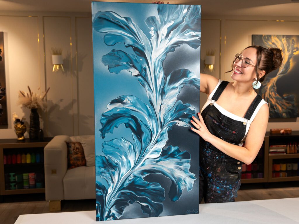
Choosing the right colors for your acrylic designs can make a significant difference in the overall impact of your artwork. Colors evoke emotions, create depth, and bring your vision to life. Whether you’re painting a serene landscape or a vibrant abstract piece, understanding how to select colors can elevate your designs. In this blog post, we’ll explore how to choose colors for acrylic designs to help you create stunning and cohesive artwork.
Introduction
Choosing colors for acrylic designs is more than just picking your favorite shades. It involves understanding color theory, experimenting with different palettes, and creating visual harmony. By mastering color selection, you’ll be able to convey the mood and message of your artwork effectively.

1. Understand Color Theory
Color theory is essential for creating balanced and effective designs. Knowing the basics of color theory helps you make informed decisions when choosing colors for your acrylic designs.
Primary Colors
- Red
- Blue
- Yellow
Secondary Colors
- Green
- Orange
- Purple
Tertiary Colors
- Mixing primary and secondary colors to create unique hues
2. Consider Color Harmonies
Using color harmonies creates a sense of balance and visual appeal. By pairing colors that work well together, you can enhance the overall look of your acrylic designs.
Types of Color Harmonies
- Complementary: Colors opposite each other on the color wheel (e.g., blue and orange)
- Analogous: Colors next to each other on the color wheel (e.g., blue, green, and yellow-green)
- Triadic: Colors evenly spaced on the color wheel (e.g., red, yellow, and blue)
3. Think About Emotional Impact
Colors evoke different emotions and set the tone for your acrylic designs. Selecting colors with emotional significance helps convey the desired mood and message.
Color Emotions
- Red: Passion, energy, excitement
- Blue: Calmness, trust, serenity
- Yellow: Happiness, optimism, warmth
4. Experiment with Color Palettes
Experimenting with different color palettes is a great way to find the perfect combination for your acrylic designs. Use trial and error to create unique and visually striking pieces.
Popular Color Palettes
- Monochromatic: Variations of a single color
- Complementary: Opposite colors
- Analogous: Colors next to each other
- Triadic: Equally spaced colors
5. Use Contrast for Depth
Adding contrast to your acrylic designs creates depth and dimension. High contrast between colors makes elements pop and draws attention to specific areas.
Contrast Techniques
- Light vs. dark
- Warm vs. cool colors
- Bright vs. muted shades
6. Consider Color Temperature
Color temperature influences how warm or cool your design feels. Balancing warm and cool colors creates harmony and visual interest.
Warm Colors
- Red, orange, yellow
Cool Colors
- Blue, green, purple
7. Test Color Combinations
Before finalizing your acrylic design, it’s helpful to test different color combinations. This step ensures that your colors work well together and achieve the desired visual effect.
Testing Techniques
- Swatch testing: Create small samples
- Digital tools: Use color palette generators
- Mock-ups: Paint small sections to see how colors interact
Conclusion
Choosing the right colors for your acrylic designs is an art in itself. By understanding color theory, experimenting with palettes, and considering emotional impact, you can create designs that resonate with your audience. Whether you’re creating for personal expression or professional purposes, mastering color selection enhances your creative process.


